Branding2023 · Craft burger joint
D'Ouro Burger
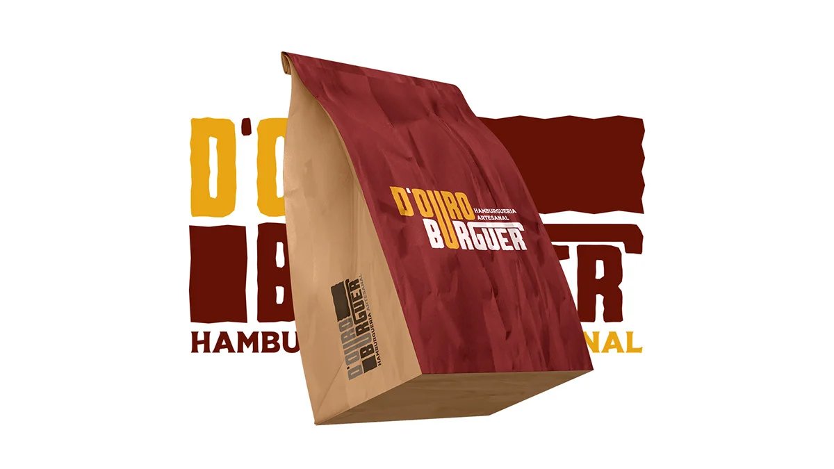
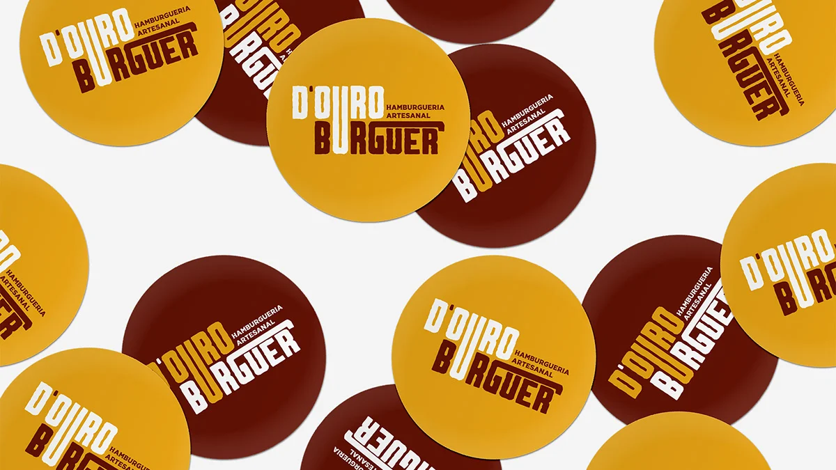
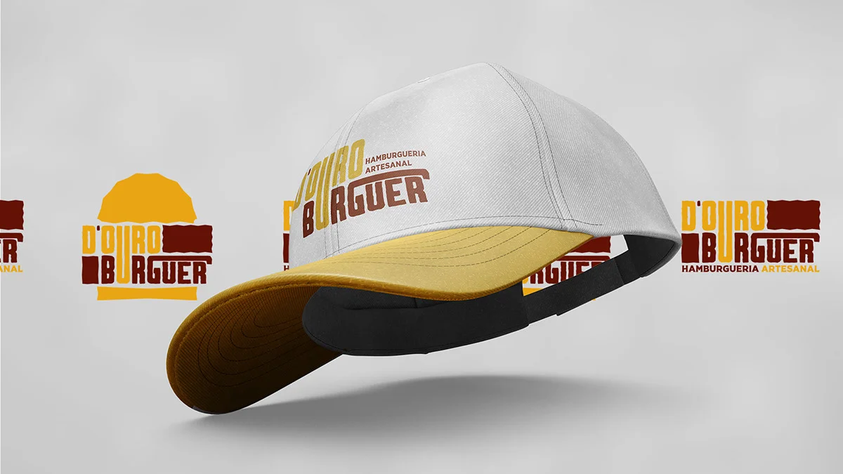
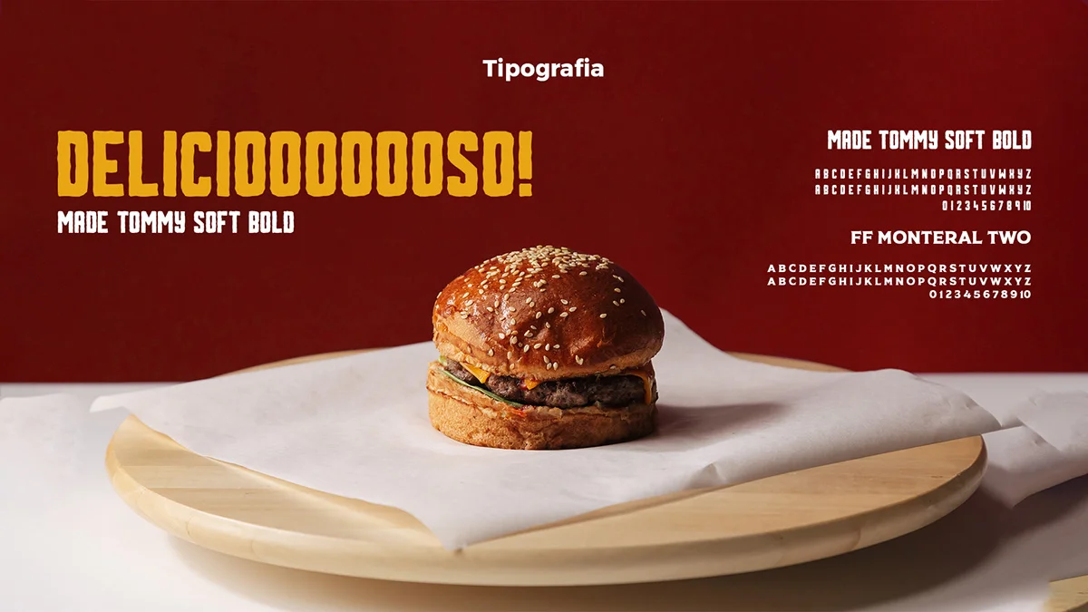
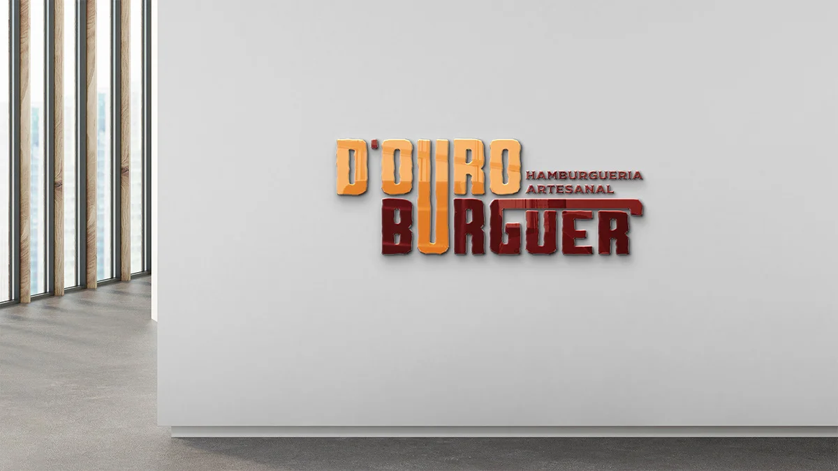
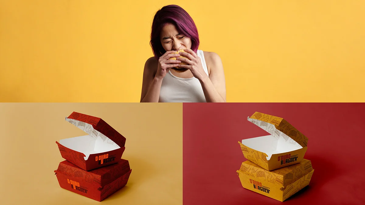
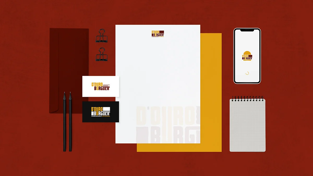
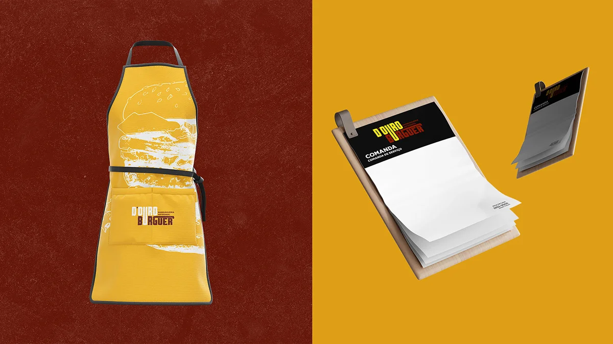
Visual identity built from scratch for a craft burger joint.
ClientD'Ouro Hamburgueria, Padre Viegas, Brazil
ScopeVisual identity
About the brand
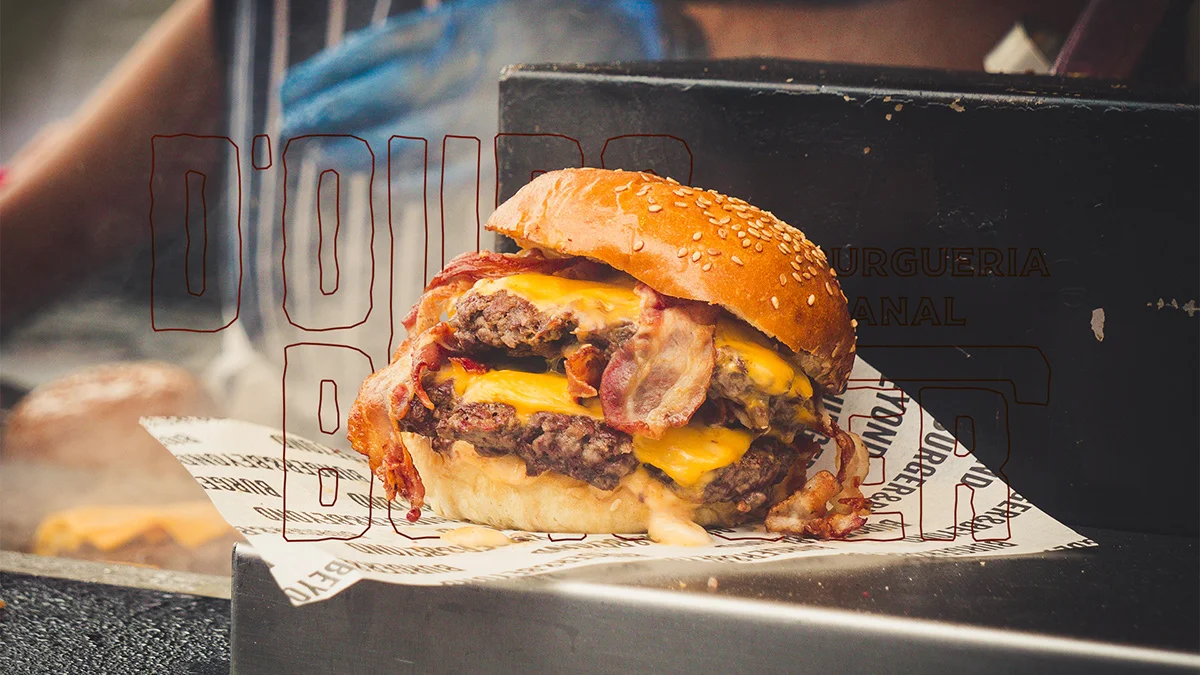
D'ouro Hamburgueria is a business located in Padre Viegas - MG that offers artisanal burgers in a charming space that blends rustic and modern elements. The atmosphere is cozy and family-friendly, with wooden tables and chairs and lighting that creates a warm ambiance. The burger shop began its activities as an emporium, selling frozen products and ready-made snacks, but after restructuring as an artisanal burger joint, D'ouro began focusing on offering an exclusive menu with quality ingredients and unbeatable flavor. The gastronomic experience provided by D'ouro Hamburgueria is simply unforgettable.
Want something like this? Let us talk.
Tell me where your brand is stuck. 30 minutes solves the first part.
Let's talk