CAPS+
Conceptual visual identity for Brazil's Psychosocial Care Centres.
Introduction – What CAPS is
CAPS was born to be a place of welcome and care. Since it was created, the Psychosocial Care Centre has been building a support network for people with mental disorders and substance users. A place where every story matters and every person has a voice.
A Little History
CAPS emerged as a response to a health model that left out listening and dignity for those who needed help. It grew with the strength of people who believe in care that goes beyond diagnoses – care that respects, listens and accompanies.
Today – Between Memes and Policy
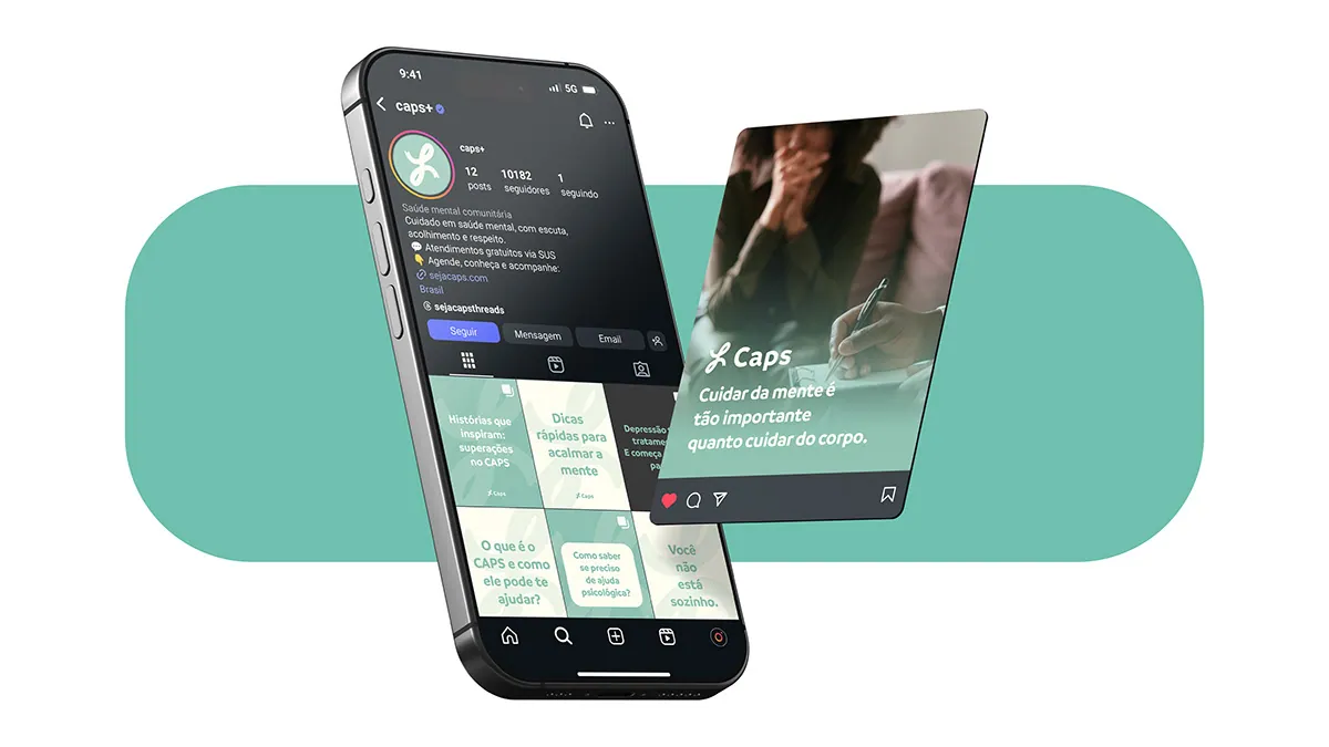
Today CAPS is the subject of memes and viral posts, often without the depth it deserves. At the same time it is part of important public policy, yet far from the eyes of those who really need it. What is missing is connection and accessible language – and that is where this project comes in.
Project Goal
The main goal of this project is to change how CAPS is perceived and make it even more welcoming, accessible and close to those who need it. I wanted to create a brand that inspires trust and breaks down prejudice, while making the services CAPS offers easier to use.
Proposal – A Redesign that Welcomes
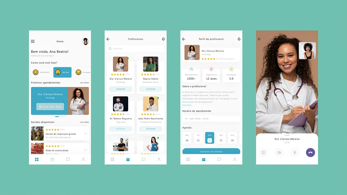
I want to bring out the real meaning of CAPS. In this project I rebuild the visual identity and create an app that is a digital hug for anyone seeking help. All of it designed to make CAPS a place that is close and human.
Breaking Away from the Government Identity
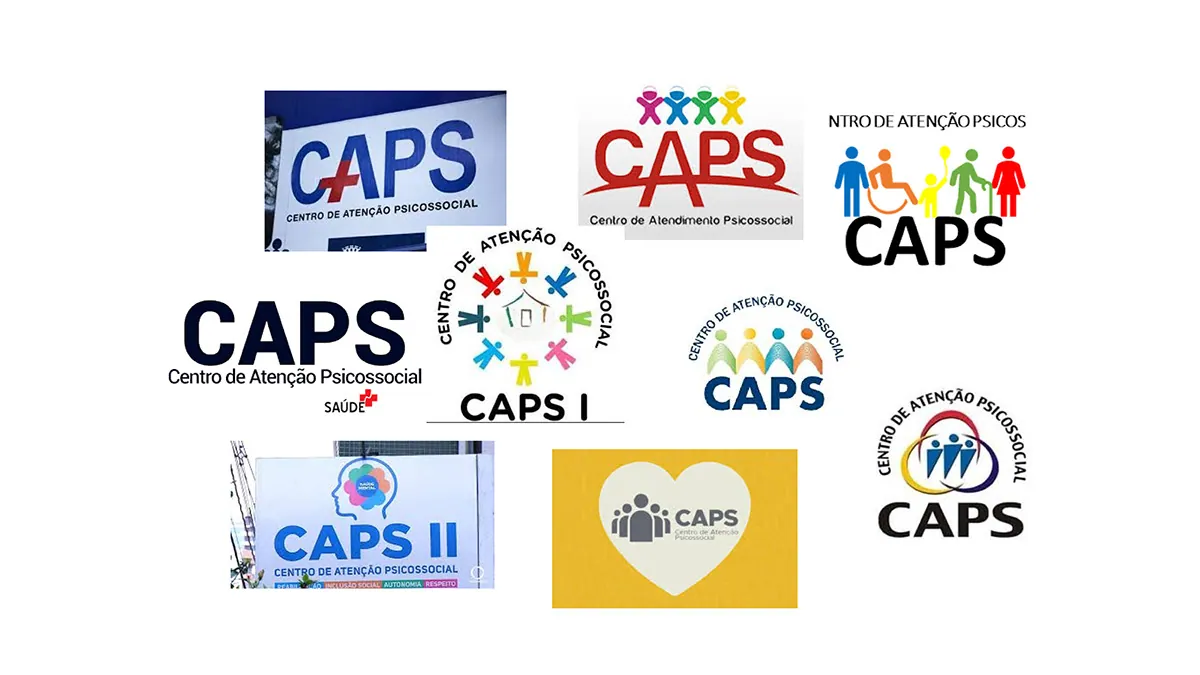
Today the CAPS visual identity is full of noise: it changes from place to place, has no defined face and often carries that heavy, rigid look typical of something purely governmental. It pushes people away instead of drawing them in. It lacks warmth and welcome. And one essential point: the CAPS brand does not belong only to the government. It has to exist beyond any political flag, so people feel safe and free to seek help. That is why this redesign is so necessary: it brings autonomy and creates an identity that welcomes, that belongs to the people, to those who need it.
Colour – Reduction and Calm
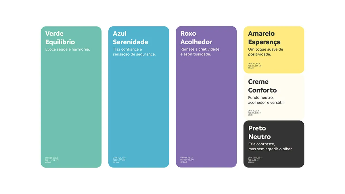
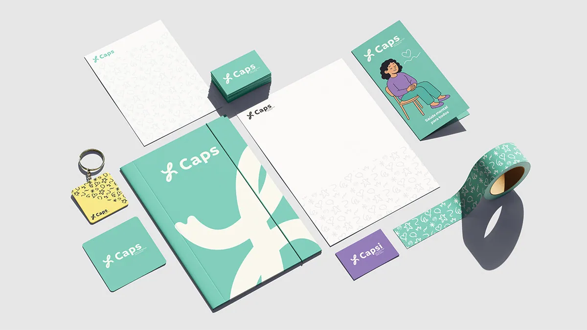
To reflect this care, the brand colours were chosen with affection.
I reduced the palette to avoid unnecessary visual stimulus and create a calm, accessible experience – especially for neurodivergent people or people in emotional distress.
I also chose not to use pure black or white. Those extreme contrasts can cause eye strain, make reading harder and feel rigid, the opposite of what CAPS wants to offer: welcome and care.
Type – Simple, Friendly Reading
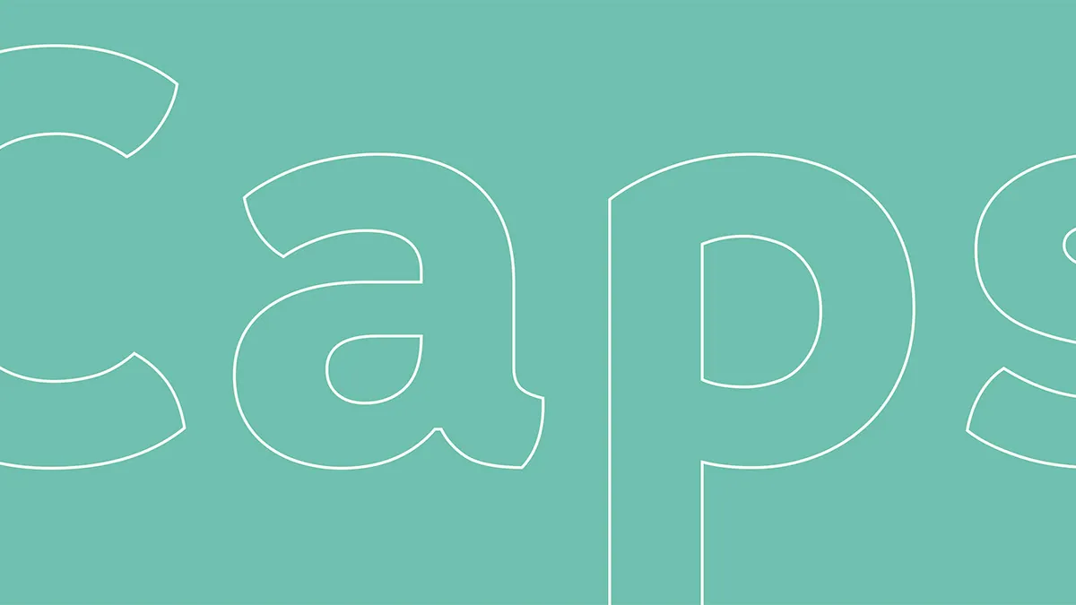
The typefaces are simple, rounded and sans-serif. Legibility comes first: no details that only get in the way of reading. These are shapes that embrace and welcome, that make every word understood at first glance.
About the Icon
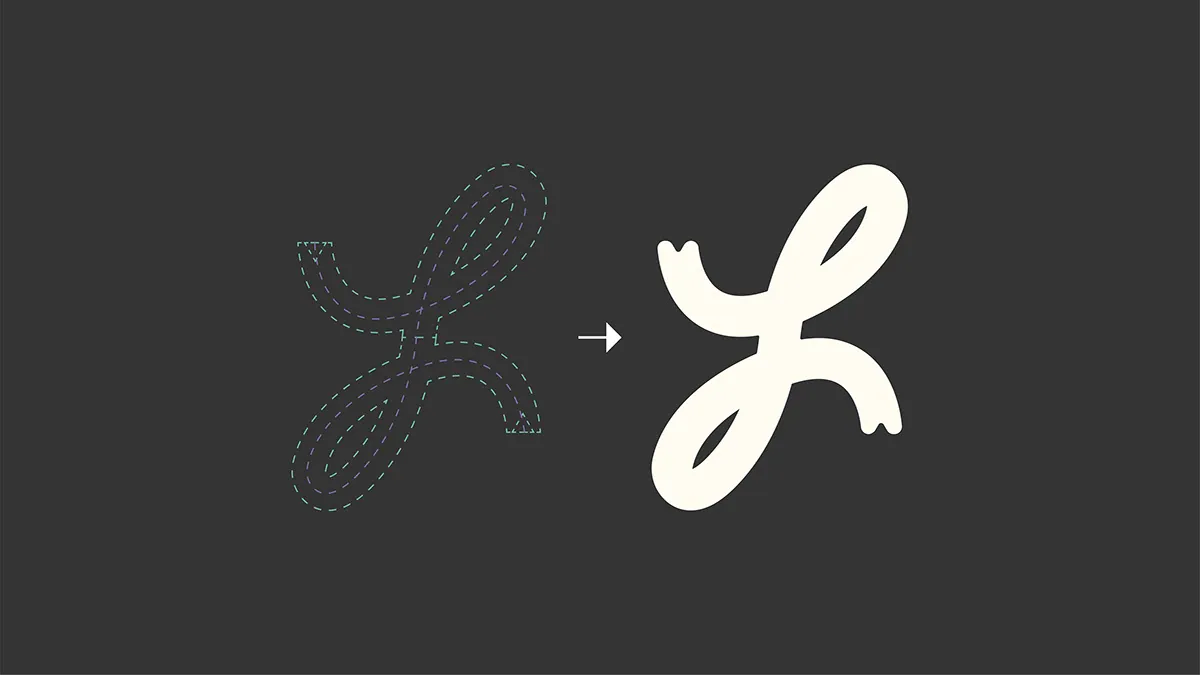
The icon was designed as a symbol of resilience and transformation – core values for CAPS and for the people connected to it. Inspired by the ribbon, so present in health and support campaigns, and by the infinity sign, it represents the continuity of care and a hope that never runs out.
Its fluid design, with no hard corners, reinforces the idea that change and adaptation are part of a living, constant process. Every curve reflects empathy, movement and connection, in harmony with the soft, welcoming tone of the identity.
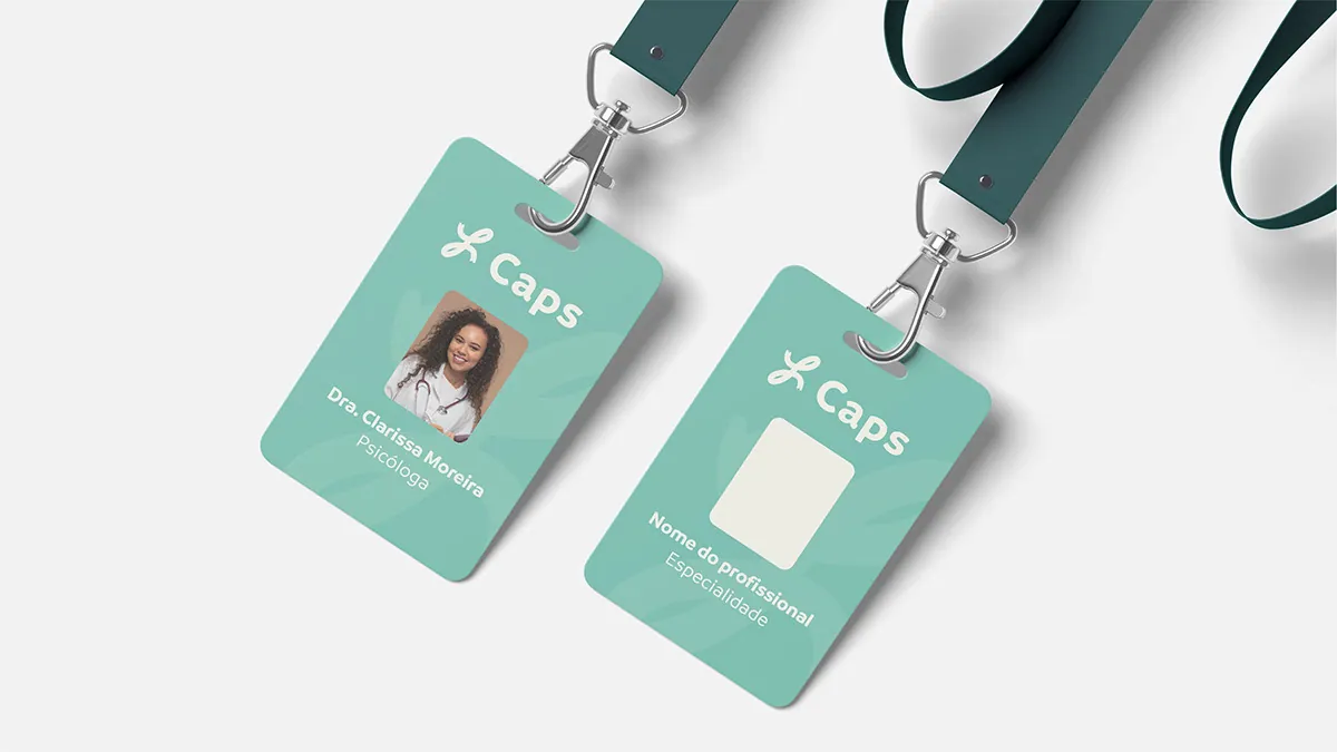
The icon also matches the visual weight of the chosen typeface, creating a coherent, balanced whole. The rounded terminals add to that softness, giving it a friendly look accessible to everyone – from patients to health professionals.
It is not just a graphic detail: it is a symbol of welcome, of bonds and of the future.
CAPS Diversity and Reach
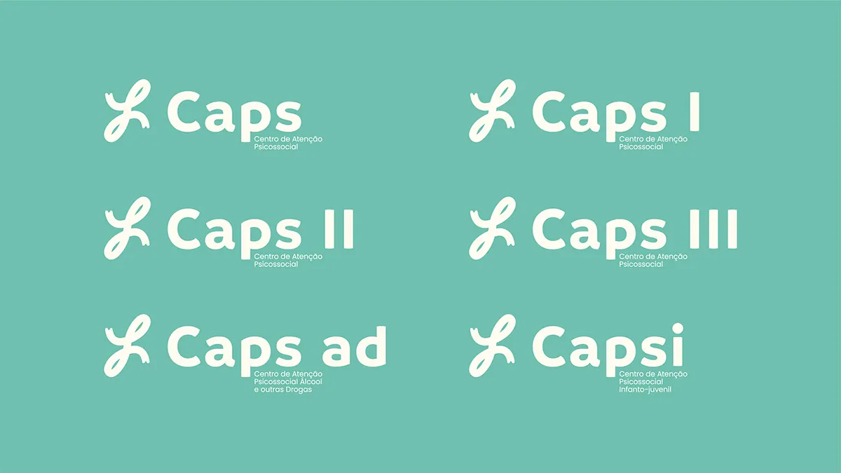
It is essential to understand the range of CAPS units: CAPS I, II and III, serving different levels of complexity; CAPS AD, focused on care and harm reduction in substance dependence; CAPS IJ, specific to children and young people.
This redesign respects those variations with a flexible, adaptable identity system that reflects the diversity of services and audiences.
About the Pattern
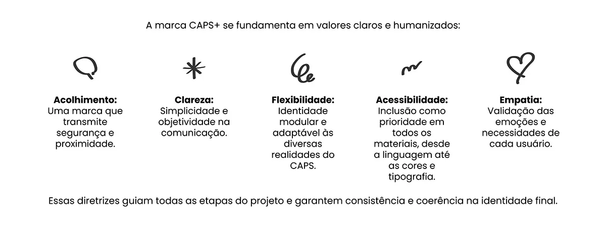
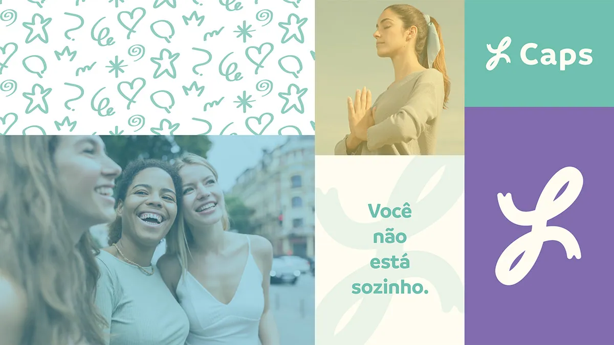
The brand pattern was made from hand drawings in a light, spontaneous style that reinforces the human, welcoming side of the project. Every stroke carries a sense of delicacy and freedom, with abstract, organic shapes that recall simple figures – hearts, stars, balloons and symbols of affection and joy.
This choice says that mental and emotional health care is close and accessible – made by people for people. The soft, friendly strokes also help create a visual atmosphere of trust, essential to what CAPS proposes.
Beyond decorating the app and brand materials, the pattern connects directly to the welcoming, flexible identity of the project. It brings interfaces, packaging and communication to life, making the whole look warmer, lighter and always open to others.

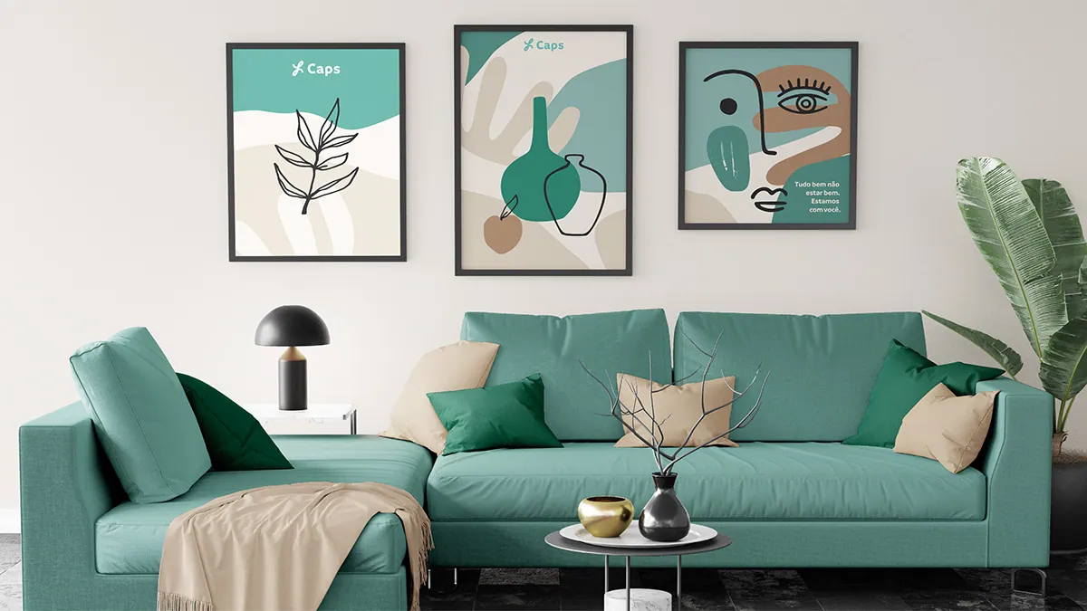

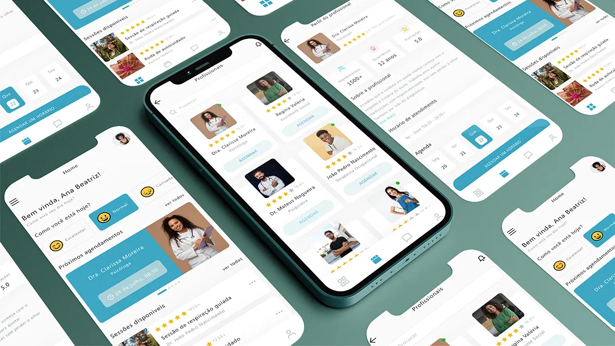
This project is a case study developed for my portfolio, aiming to raise awareness of CAPS (Psychosocial Care Centres) and demystify how it works.
It seeks to value mental health care and show, in an accessible and sensitive way, how the service welcomes and supports people, helping to break stigma and bring the public closer to more human, much-needed care.
Want something like this? Let us talk.
Tell me where your brand is stuck. 30 minutes solves the first part.
Let's talk