LocServ
Logo redesign for a machinery rental and transport company.
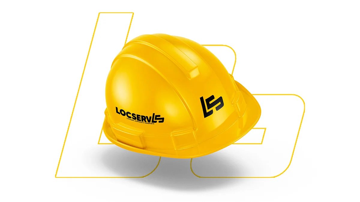
LocServ - Machinery and equipment rental
About the brand:
Locserv is an innovative and traditional brand in the city of Mariana, Minas Gerais, one of the first towns in the state. Specialising in machinery, equipment and transport rental, the company stands out for offering tailored solutions to its clients. From cargo trucks to heavy machinery, Locserv makes sure you have the right equipment for every task.
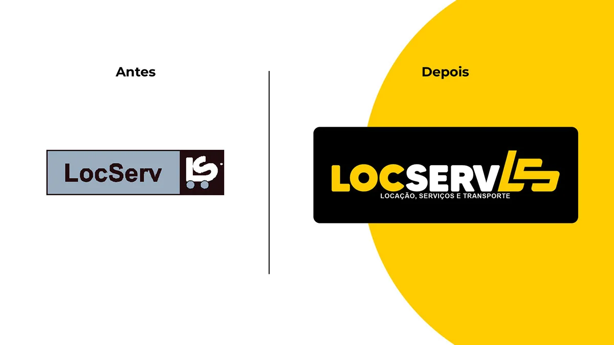
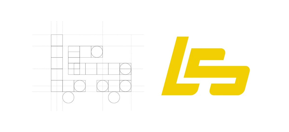
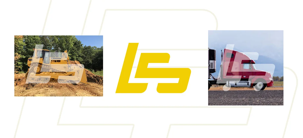
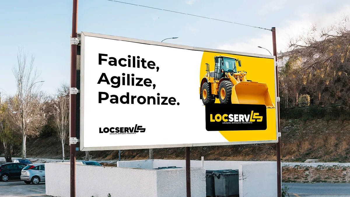
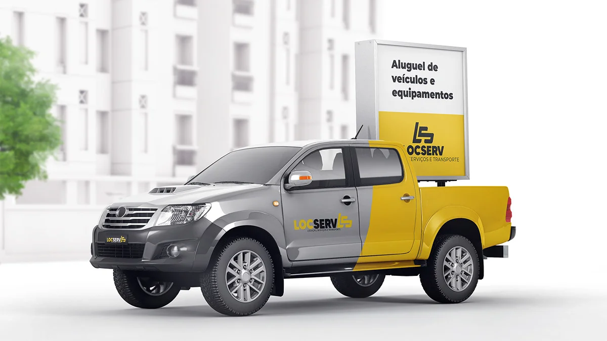
The company went through a visual identity redesign, in which I worked on renewing its logo. The new logo has more modern shapes and an icon that represents the company's activities well. Built from Locserv's initials, the icon also evokes machines and transport, and its slant suggests movement and dynamism.
During the redesign process, comparisons between the old and new logos were presented, highlighting the grids used in the construction and the visual evolution. The new design alludes to transport, cars and machines, reinforcing the connection with the services Locserv offers.
With a highly skilled team committed to excellence, Locserv delivers efficient, high-quality solutions across the country, with the mission of providing the best equipment rental service, helping clients carry out their projects efficiently and safely.
Want something like this? Let us talk.
Tell me where your brand is stuck. 30 minutes solves the first part.
Let's talk