Delícias Caseiras
Logo modernisation for a family breakfast business.
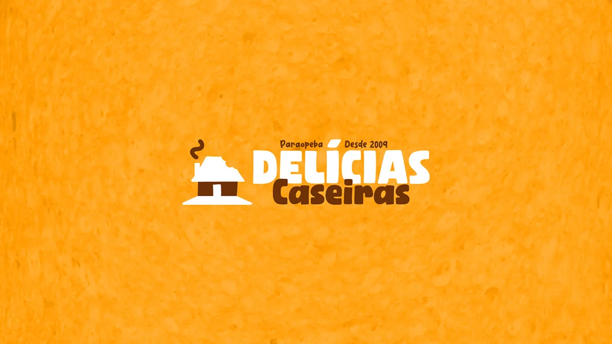
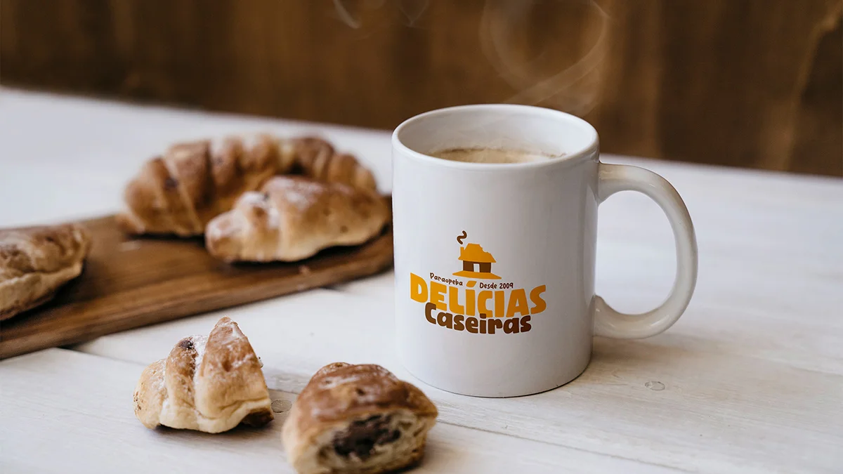
Delícias Caseiras is a business located in Paraopeba – MG that offers breakfast foods. Its catalog includes a variety of handmade products for the table, such as different types of cakes and delicious cookies. The company was founded in 2009 with the aim of providing the best of home cooking and, since then, it has sought to provide not only a good taste experience capable of stimulating the emotional memories created in moments of leisure and coffee, but also to make the mundane routine present in everyone’s daily life more enjoyable.
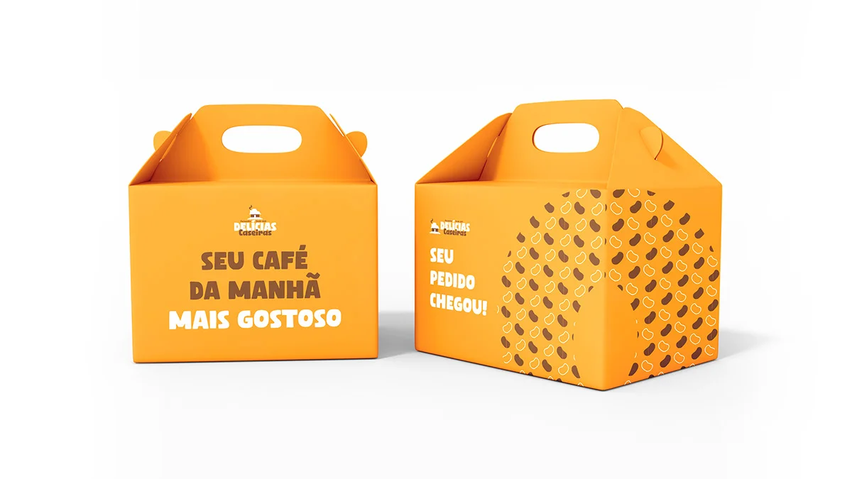
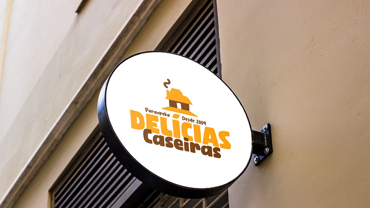
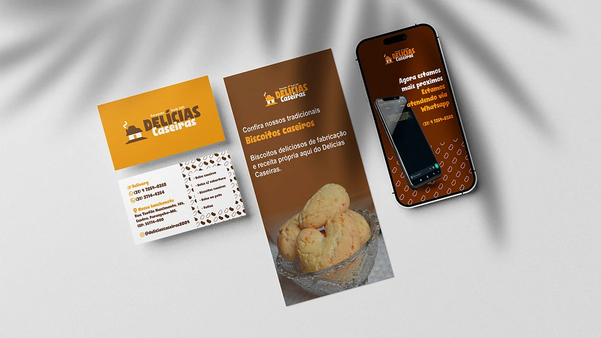
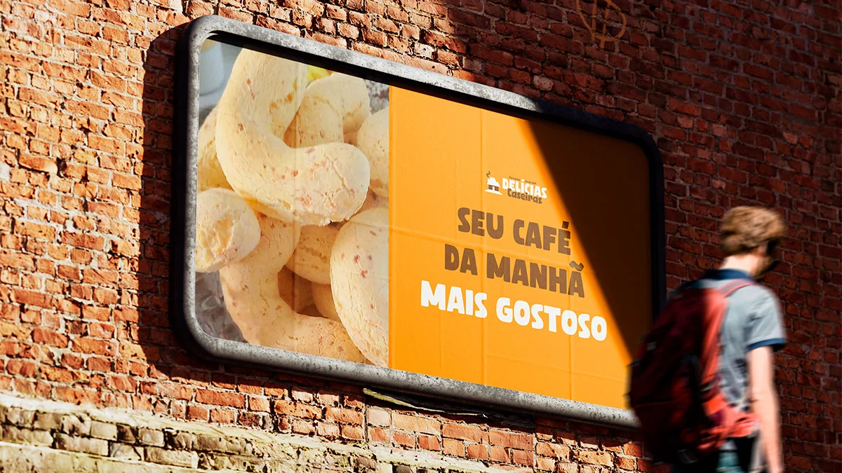
Delícias Caseiras is a very traditional family business, well known for its famous ‘romi cookies’ which are a hit in the city. Lucas, the family’s son, approached me to update the old logo and modernize it without losing the essence of the company. Our idea in this project was to bring modernity and professionalism without losing the roots of a company that was already a breakfast tradition for the residents of Paraopeba and the region.
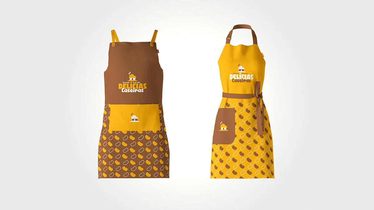
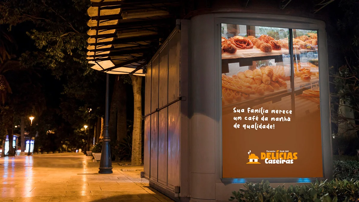
I worked on organic shapes with sober lines and warm colors to bring out all the comfort and warmth the brand exudes.
Want something like this? Let us talk.
Tell me where your brand is stuck. 30 minutes solves the first part.
Let's talk