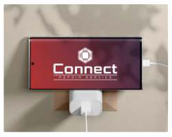
Connect Repair Service
Logo and visual system redesign for an electronics repair shop.
Context
A repair shop does not sell repairs. It sells the calm of someone leaving an expensive device on a stranger's counter and walking away hoping for the best. Connect did that part well. What did not keep up was the brand: a logo that could have belonged to anything, applied one way on the storefront and another on the quote.
Challenge
The problem was conversion, not taste. People looking for a repair shop compare three options on Google Maps in two minutes and pick the one that looks most serious. With no visual signal of professionalism, Connect lost customers before the first conversation and was left competing on price, which is the worst possible fight for someone who does the job properly.
Solution
I did the opposite of what the category does: I cut the gears, the screwdriver and the lightning bolt. A repair brand crammed with technical icons reads as a backyard workshop. What signals trust there is cleanliness and consistency.
I built the visual system to be used by someone who is not a designer, because a brand that only works when the designer applies it falls apart the following month. Few colours, clear hierarchy, simple application rules. Storefront, social and quotes now come out recognisable without depending on me.
Want something like this? Let us talk.
Tell me where your brand is stuck. 30 minutes solves the first part.
Let's talk